Color is a powerful storytelling tool in filmmaking, especially in character development. Directors, cinematographers, and costume designers use color palettes to help define characters, convey emotions, and highlight character arcs. A carefully chosen color palette can create immediate associations, making characters memorable and evoking emotional responses from audiences. This article explores how color palettes shape character perception in films, delving into emotional symbolism, character development, cultural influences, costume design, and visual storytelling techniques.
Emotional Symbolism of Colors: Setting the Tone for Characters
Colors often have psychological and emotional connotations, and filmmakers use these associations to shape how viewers perceive characters.
Warm vs. Cool Tones
The distinction between warm and cool tones is one of the most common ways to convey character traits. Warm colors like red, yellow, and orange are often associated with passion, intensity, and warmth. These colors are frequently used for characters with fiery personalities or those driven by strong emotions, such as love or anger. In contrast, cool colors like blue, green, and purple suggest calmness, isolation, or introspection. Characters portrayed in cool tones may appear more reserved, intellectual, or mysterious.
For example, in The Dark Knight, the Joker’s appearance is dominated by dark, cool tones, symbolizing his chaotic yet cold demeanor. Batman, often cloaked in a deep blue-black suit, also embodies mystery and detachment, matching his complex, brooding character.
Psychological Impacts
Color can have a psychological effect on audiences, subtly influencing their emotions and perceptions. Red, for instance, is known to evoke feelings of excitement or tension, making it ideal for characters in moments of anger or love. Blue can induce calm but may also imply sadness or melancholy, adding layers to a character’s emotions. Filmmakers use these effects to enhance character portrayals, giving audiences a subconscious sense of who these individuals are and how they feel.
Color Associations
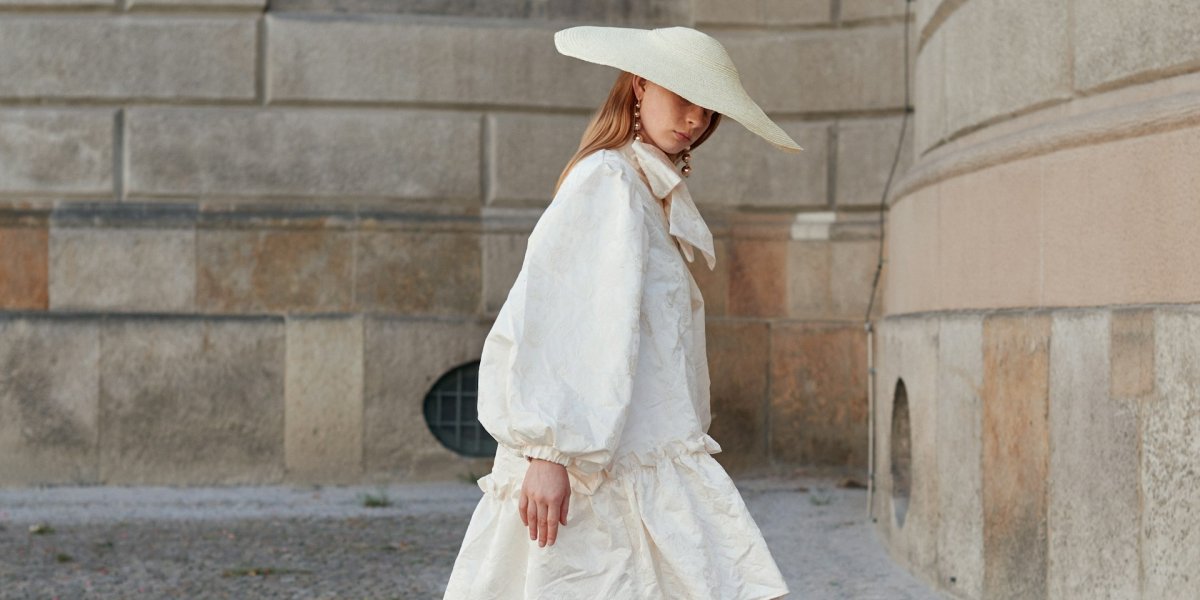
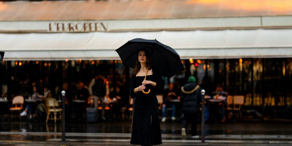
Specific colors have established cultural and emotional associations that influence how audiences perceive characters at a glance. For example, black is often associated with power, mystery, or even villainy, making it a common choice for antagonists or morally complex characters. White may represent purity or innocence, frequently used for protagonists or virtuous characters. Color associations help create immediate impressions, allowing filmmakers to communicate character traits subtly and effectively.
Character Development Through Color: Visualizing Growth and Transformation
As characters progress through a story, their color palettes often shift to reflect their internal journey and growth.
Character Arcs
Color can effectively visualize a character’s arc, particularly when changes in the color palette mirror the character’s development. As a character grows or faces challenges, their colors may shift from light to dark, or from muted tones to vibrant hues. This visual progression reflects their journey, giving audiences a deeper understanding of their transformation. In Breaking Bad, Walter White’s wardrobe shifts from lighter colors to dark, ominous tones as he descends further into moral ambiguity, visually representing his complex journey.
Growth Indicators
Changes in color can indicate a character’s growth or evolution, particularly when moving from dull or muted colors to bright, bold tones. For instance, a character who begins as shy or insecure may initially be dressed in neutral colors, later transitioning to more vibrant clothing as they gain confidence. This transformation can subtly communicate the character’s newfound strength or purpose without explicit dialogue, enhancing visual storytelling.
Color Shifts
Color shifts can be sudden or gradual, depending on the story arc and the director’s intent. A gradual color change might indicate slow character development, while a sudden color shift can signify a dramatic transformation. Color shifts in costume, lighting, or makeup provide audiences with visual cues about the character’s changing mindset, allegiances, or internal struggles. These shifts help convey the psychological complexity of characters, enriching their depth and relatability.
Cultural and Contextual Influences on Color: Enhancing Character Nuance
Cultural and contextual factors influence how color is used in character design, adding layers of meaning and relevance.
Cultural Color Meanings
Colors carry different meanings across cultures, and filmmakers often leverage these cultural associations to add depth to their characters. For example, red is associated with luck and happiness in many Asian cultures, whereas in Western contexts, it may symbolize danger or romance. By using culturally specific color symbolism, directors can add nuanced layers to characters, making them resonate with diverse audiences. In Crouching Tiger, Hidden Dragon, traditional Chinese colors and costumes play a significant role in defining character traits and themes.
Genre-Based Choices
Genres often have specific color palettes that guide how characters are portrayed. Film noir, for instance, relies heavily on shadows, black-and-white contrasts, and muted tones to create a mood of mystery and suspense, which enhances character perception in detective or crime narratives. Romance films might favor pastels, while action movies use high-contrast colors to create excitement. Genre-based color choices help audiences understand the characters’ roles within the story, whether they’re a hero, love interest, or antagonist.
Historical or Fantasy Setting
In period pieces or fantasy films, color choices often align with the historical context or fictional world’s aesthetic. Costumes and lighting choices reflect the setting, grounding characters in their environment and making their roles feel authentic. For example, fantasy characters might wear earthy tones to signify a connection to nature, while historical dramas use historically accurate colors to maintain authenticity. Such choices allow the audience to connect with characters in ways that are specific to the film’s world.
Costume Design and Makeup: The Subtle Art of Character Definition
Costume design and makeup play essential roles in character development, with color choices in clothing and accessories offering insights into personality, status, and relationships.
Costume Color Schemes
Costume designers use color schemes to enhance character traits and relationships. Heroes might be dressed in brighter colors to make them stand out, while villains wear darker or muted tones. Designers may also use contrasting colors to highlight conflict between characters. For example, in Harry Potter, Gryffindor students wear bold red and gold, symbolizing bravery, while Slytherin’s green and silver signify ambition and cunning. These choices reinforce character identities and deepen the audience’s understanding of each group.
Makeup and Color Matching
Makeup color choices complement a character’s costume and can enhance emotional resonance. For instance, dark makeup may be used to signify mystery or danger, while natural tones indicate innocence or purity. Makeup choices can align with the character’s personality, mood, or transformation, making them more relatable and visually appealing. Matching makeup with costume colors or accessories adds cohesiveness to the character’s appearance, creating a more immersive experience for viewers.
Subtle Details in Accessories
Accessories in specific colors can reveal hidden aspects of a character’s personality or foreshadow their journey. A character wearing a red scarf might be hiding a passionate side, or a hero wearing a green pendant could hint at growth and renewal. These small yet significant choices in accessories enhance character depth, providing audiences with visual hints about the character’s motivations or future actions.
Visual Storytelling and Cinematic Techniques: Enhancing Character Perception
Directors and cinematographers use lighting, color grading, and contrasts to highlight character traits and influence audience perceptions.
Lighting Choices
Lighting choices play a critical role in how characters are perceived, with warm lighting suggesting warmth and cool lighting creating distance or detachment. Directors may use colored lighting to enhance emotional moments or define a character’s state of mind. In Drive, the use of pink and blue lighting reflects the protagonist’s isolation and inner turmoil, visually reinforcing his complex personality.
Color Grading in Post-Production
Color grading in post-production allows directors to control the film’s overall tone, matching the character’s palette with the mood and visual theme. By adjusting color saturation, contrast, and temperature, filmmakers create a cohesive look that enhances character arcs and emotional depth. The muted, grayish tones in The Road emphasize the bleakness of the story and the characters’ struggles for survival.
Symbolic Contrast
Contrasting colors can create visual tension between characters, highlighting conflicts or dualities. For example, a protagonist in white and an antagonist in black create an immediate visual contrast, emphasizing their moral differences. This symbolic use of color contrast helps audiences quickly identify the relationships between characters, contributing to the story’s emotional impact.
Color palettes in films are more than just aesthetic choices; they’re integral to character definition and storytelling. Through careful use of color, filmmakers shape how audiences perceive characters, communicate emotional undertones, and highlight character growth. From costume design to lighting and color grading, color remains a powerful visual language that helps characters resonate with audiences and adds depth to their cinematic journeys. By understanding the psychological and cultural associations of color, filmmakers can craft characters that are memorable, relatable, and visually compelling.


